
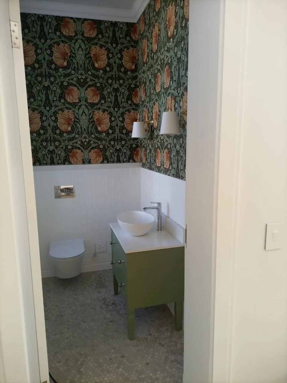
What to do with a small bathroom
A small room is the easiest room to be brave in. Why the usual advice about pale colours is wrong, and what actually works on a cloakroom wall.
The standing advice for a small room is to keep it pale so it feels bigger. It is not wrong exactly, but it produces a lot of forgettable bathrooms.
The other approach is to stop apologising for the size. A cloakroom is a room nobody spends an hour in, which makes it the one place in the house where a pattern can be as loud as you like. Guests notice it precisely because it is a surprise, and you are not living with it at breakfast every day.
A few things we have learned from printing them.
Dark works. A deep floral or a dense botanical in a small room reads as considered rather than cramped, particularly above panelling, where the paper sits as a band rather than a whole wall. The Val de Vie cloakroom in our portfolio is exactly that: a dark floral above white panelling, in a room you could cross in two steps.
Scale is the decision people get wrong, not colour. A pattern that repeats often makes a small wall busy; the same design at a larger scale can make it calm. This is worth testing rather than guessing, and the visualiser lets you change the repeat and see it.
A study is the same argument with a different constraint. You do look at that wall for hours, so the thing to avoid is a pattern with a strong rhythm sitting directly in your eyeline behind a screen. Put the bold wall behind you, where it is in every video call and none of your own field of view.
And the small rooms are cheap to be brave in. Most cloakrooms are one drop of paper. If you hate it in three years, it comes off cleanly and you print something else.
More from the journal
See it on your own wall.
Photograph the wall, pick a design, and the browser paints it on for you. It is free and there is nothing to install.